Font Families
They are everywhere. We surround ourselves with them from every side - there are so many of them that we often stop noticing how different they are. Today we will talk about typography, fonts, and type.

Mateusz Jabłoński
From this article you will learn:
- What is roman type?
- What is the difference between a font and type?
- Which sans-serif font is one of the oldest?
- How many characters should one line of text contain on a website?
- What are generic font families in CSS?
We often pay a lot of attention to what we write. We try to dress our thoughts in words as vividly as possible, so that our message reaches the reader in the best possible way. We use all kinds of literary devices, such as metaphors, paraphrases, and many others. But do we realize how important the typeface of our fonts is?
Every UX designer knows that people buy with their eyes. The typeface we choose has a fundamental impact on how a text is received. Imagine a situation in which we have to read information signs set in a beautiful, fairy-tale-like font, where every letter has a huge flourish. An information sign is not there to be admired. It is there to communicate information quickly, so the message has to be readable and simple.
Typography
In the past, the word typography was used to describe a printing house or the printing process itself. Today, by typography we very often mean everything related to the visual aspect of text. In practice, it comes down to making sure that the text is as readable as possible and properly reflects the character of the content being communicated. Notice that text accompanies us almost everywhere - from books and articles, through information signs, instructions, TV programs, logos, and websites. The most popular definition of typography is the one given by the Department of Typography and Graphic Communication at the University of Reading, which says that typography is design for reading.
It is no surprise, then, that information carriers such as websites also use typography - of course in a slightly different form, adapted to the medium and enriched with a few additional rules. Not all of them will be important for a frontend developer, but it is worth knowing about them, if only because it makes cooperation with interface designers for websites and applications easier.
Font or Type?
Before we move on to the next parts of this topic, I would like to point out one fairly important thing. Font or type - in everyday language these names are often used interchangeably, but it is worth knowing that they refer to different things.
First, type means the small metal blocks with raised letters that were once used by typesetters. A typesetter was a specialist who manually arranged type into the right sequences to prepare a publication for printing.
A font, on the other hand, is the digital equivalent of a set of type. In other words, it is a file that contains information about the shapes of letters and characters within a single typeface. A typeface is the collective name for type from one family, for example Arial or Times New Roman.
This is where the specialists' resistance comes from - a font is not the same thing as type. Notice that even CSS properties related to typefaces start with the word font, not type.
How Should It Look?
A designer usually starts work by planning the structure of the content. Ideally, the copy is prepared earlier. Then, based on its amount and on what we want to present, the designer makes decisions about layout, paragraphs, and subheadings. Contrary to appearances, it matters a lot, for example, how and in what order we number headings, from h1 to h6. This also becomes the basis for choosing line height. The distance between individual lines is very important - if it is too small, consecutive lines will overlap; if it is too large, the text becomes harder to read.
Another element worth remembering is line length. According to research, the ideal number of characters in a line should be somewhere between 50 and 75. Longer lines tire the user, mostly the eyes, and make the reader lose their place while reading, because they disturb the reading rhythm.
Another important aspect is text alignment. Aligning text to both edges is very tempting, but in reality it produces the opposite effect to the one we want - it tires the reader instead of helping them. Even though it may seem like a purely aesthetic decision, it is not. We should align text to the side from which we read. In Europe this will most often mean left alignment, while in Arabic-speaking countries it will be right alignment.
Another important topic is color selection. And as is usually the case - less is more. There should be few colors, and they should contrast well with the background.
I have generally described the most important elements of typography on a website. So there is only one problem left, and it is the subject of this article - fonts.
Roman Type
Typefaces based on the Latin alphabet are called roman type. Roman type is most commonly used in all kinds of printed materials in languages derived from Latin. Before roman type was introduced, blackletter was used most often. Interestingly, uppercase letters in roman type come from the monumental lettering of ancient Rome, while lowercase letters come from the Carolingian minuscule used in the time of Charlemagne. Roman type appeared around the same period in which Gutenberg developed printing technology based on movable type. Although it was not the most popular style at the time, it replaced blackletter quite quickly.
Contemporary typefaces do not look like classical roman typefaces. Still, serif and sans-serif typefaces, which are so common today, are included in this group.
The Serif Family
Serif typefaces are typefaces whose letters contain decorative details in the form of horizontal and vertical strokes. They are most often used in printed materials - books and newspapers. On the Internet, serif fonts are usually not the best choice for longer blocks of text, because they can make reading harder. Remember that a user decides whether a given piece of online material is interesting in about 3 seconds.
A very popular idea is to use serifs for titles and headings to emphasize their importance. This is the exact opposite of print.
We can distinguish four types of serifs: slab serifs, such as Rockwell; wedge serifs, such as Times New Roman; hairline serifs, such as Bodoni; and hidden serifs, such as Fontin. The typefaces mentioned above have been with us for quite a long time. For example, probably the best-known serif font, the already mentioned Times New Roman, was designed in 1932. Bodoni, on the other hand, comes from the 1780s. Interestingly, even though almost 250 years have passed since it was created, it is still often used, for example in the headings of Vogue magazine.
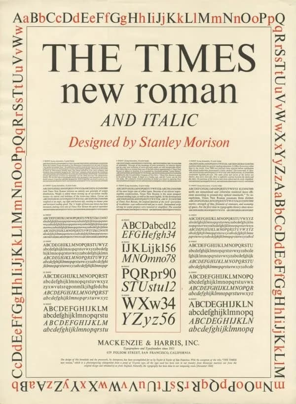
The Times New Roman and Italic, designed by Stanley Morison / source: encyclopedia.design
The Sans-Serif Family
The opposite of typefaces from the serif family are sans-serif typefaces. They are characterized by simplicity, have no decorative details, and rely on a more uniform stroke width. Example fonts from this family include Arial and Helvetica.
Arial was designed in 1982. Helvetica is a little older - it dates back to 1957. Both of the above are proportional typefaces, which means that the width of individual characters depends on the natural shape of the letters. Another sans-serif typeface, but a non-proportional one, is Courier. Because of its origin, Courier may already feel closer to the IT industry, since it was designed for IBM in the 1950s. One of the first sans-serif fonts is Futura, created in 1928. Earlier forms without serifs also existed - Nordic runes, for example - but officially they are not considered part of this family.
Originally, sans-serif fonts were considered controversial and caused a lot of mixed emotions. They were described as grotesque.
Other Useful Typefaces
The two families above are the ones most often used in both print and web materials. We can also distinguish other typefaces: decorative type, calligraphic script, meaning handwriting, and Egyptian, a variety of serif typeface which, unlike a typical serif, has a uniform stroke width. One example of an Egyptian typeface is Memphis, designed in 1929. There are many kinds of typefaces, and even though I have mentioned only a few of them, the variety is already visible. Each typeface has its own specific features and fits a different kind of content. For example, sans-serif fonts are often chosen by the finance industry because they are concrete and simple, and that is exactly how this industry wants to position itself in the eyes of customers.
Worth reading on this topic
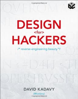
David Kadavy
Design dla Hakerów. Sekrety genialnych projektów.
Generic Families in CSS
When creating websites, font settings are defined in CSS code. CSS contains several properties responsible for declaring the font type, style, weight, and so on. One property that interests us from the perspective of this article is font-family. This property accepts, as its values, the fonts that should be used to display a given text. It recognizes two types of values. First, there are so-called family names, meaning the names of specific typefaces, such as "Arial" or "Times New Roman". Second, it can accept so-called generic family names, meaning names that define what kind of typeface should be used, such as serif, sans-serif, monospace, cursive, fantasy, system-ui, ui-serif, ui-sans-serif, ui-monospace, ui-rounded, math, emoji, and fangsong.
The generic font family mechanism protects a project from using the default font when the one we specified is not available on the user's device. For example, if we want our text to be written in Consolas, but the recipient does not have that font on their computer, we can indicate that another font from the monospace family should be used. Following the trail of creation dates, let us add that Consolas is quite a young font, since it is only 16 years old.
In CSS, it could look like this:
.css-class {
	font-family: Consolas, "Lucida Console", monospace;
}
By providing several fonts, we can define a hierarchy of importance. In the example above, the browser will try to use Consolas. If it cannot find it, it will try Lucida. If it cannot find that either, it will use the default font for the monospace family.
Summary
And suddenly it turns out that we can turn font families into a large family tree, where different branches cross and split in different directions. There are many ways to combine them. The most important thing is to learn to read the emotions connected with them and choose them appropriately for the project we are creating - whether we are designers or programmers. The most interesting projects mix different families and achieve the best effects this way. If we add the rules I mentioned at the beginning of this article, we can achieve an effect that strengthens our message, tells something about our emotions, and creates the result we expect.
Sources
- Wybór właściwej czcionki: szeryfowa lub bezszeryfowa
- CSS font-family Property
- Antykwa - krój pisma, historia i rodzaje antykwy
- Antykwa
- Czcionka szeryfowa – czym jest i w jakim celu się ją stosuje?
- 8 złotych zasad typografii do zastosowania już dziś!
- font-family
- What Are the Generic Font Families in CSS?
- Jakie są kroje pisma i jak je dobierać do swoich projektów?
- Stanley Morison (1889-1967) – Designer of Times New Roman typeface
- Antykwa
- Podstawy projektowania: Typografia
- Times New Roman
- Arial
- Consolas
- Typeface
- Monospaced font
- Co to jest typografia?
- Typografia
- Typografia – co to jest i jak efektywnie ją wykorzystać
- Font Family – Rodziny Czcionek
- Rodziny fontów. Tak różne a tak spójne
- Bodoni
- Helvetica
- Courier (typeface)


Comments (0)
No one has posted anything yet, but that means.... you may be the first.