The Magic of Pixel Perfect
In the days when we dialed into the Internet, an approach was born that defined web development for many years. Today it is not quite as popular, but in my opinion it is still worth knowing and understanding. Let's talk about the magic of pixels.

Mateusz Jabłoński
From this article you will learn:
- How big is a pixel?
- What is Pixel Perfect Design?
- What is Look & Feel in graphic design?
- Is Pixel Perfect still possible today?
A pixel is the smallest image element we can imagine. There are, of course, subpixels that pixels are made of, but that is a story for another time. A pixel is basically a point on the screen in one uniform color. Everything we display on a monitor is made of pixels. One pixel is usually around 0.28 mm, which means it is truly tiny. When we think about the resolution of our monitors, it is expressed precisely in these tiny points. A screen with a resolution of 1920x1080 has 1920 pixels in each of its 1080 rows, which means that at any given moment such a screen displays over 2 million little squares. If we placed all those pixels next to each other, the line would be more than half a kilometer long, almost 581 meters.
I deliberately started today's story by explaining what a pixel is. I wanted to show how important this element is in designing and programming user interfaces, even though it is so small. Very often, the most serious problems come from not understanding the smallest things. I suspect that most people who had a chance to work in the Pixel Perfect approach were honestly fed up with pixels. I was one of them.
What is Pixel Perfect Design?
In the days before RWD (Responsive Web Design), bah!, in the days when websites were "sliced" from a layout prepared by a designer and the resulting squares were placed inside HTML tables, nobody dared to imagine that a website could look even slightly different from the graphic design. They would not dare because, de facto, the whole page, apart from the text, was one huge image. Or rather, dozens of images. These were the days when nobody cared much about different resolutions, because most devices were fairly consistent in that regard. These were the days when CSS support was so-so, and it was difficult to guarantee that a website written only in CSS would look the same in every browser. Finally, these were the days when we dialed into the Internet. You could say prehistory.
Still, it is in those prehistoric times that we can look for the beginnings of Pixel Perfect Design. That was when the web creator community began telling clients that they would get exactly what the designer drew. And it was not a lie. It was possible, but the websites created at the time were often overloaded with graphics. The technological constraints were so significant that people did not try to create complex animations (allow me to skip the Flash thread in this story) or advanced content structures. Usually, it was a simple 2- or 3-column layout, with a separate header and footer. That simplicity limited both designers and developers to some extent.
A time of growth
Simplicity was good at the beginning, but over time people wanted more, better, and faster. Websites were supposed to be lighter, faster, prettier, and much more complex. Logic was still executed on the server side, but CSS developed, and the jQuery and jQuery UI libraries saw the light of day. Because of these new technologies, people started moving away from "slicing" layouts into tables, and two CSS properties entered common use: float and clear.
To describe the direction web development took, let us imagine the following situation. We have two rows, and each of them contains 3 columns, but the text in each column has a different length. The float property with the left value allows us to arrange columns next to each other. There is no flexbox or CSS grid yet, and we do not want to use tables. The columns are divs, so they are block elements, which means we can modify their height and width. Knowing that, let us assume that each column should take one third of the screen width. In my thinking, there does not seem to be any mistake. The code looks like this:
<div class="row">
  <div class="col">[ROW 1 COL 1] Lorem ipsum dolor sit amet consectetur adipisicing elit. Iste cupiditate pariatur suscipit.</div>
  <div class="col">[ROW 1 COL 2] Lorem ipsum dolor sit, amet consectetur adipisicing elit. Ipsam officiis debitis libero. Doloremque necessitatibus suscipit eveniet eius sunt in expedita sint, nostrum, ab obcaecati consequatur hic. Minus, unde molestias porro, vitae dolorem doloremque fugit omnis quas laborum officiis voluptates magni et neque quod accusamus blanditiis natus optio? Mollitia quod ad iste quo laboriosam, blanditiis earum numquam inventore enim neque quae atque vitae, vel ducimus provident quaerat veniam totam. Vitae quisquam totam non animi dolorem soluta sint nisi possimus, esse, a necessitatibus reprehenderit sapiente. Exercitationem voluptatem error magni molestias unde laudantium perferendis delectus, modi natus architecto iure, quidem, similique consequuntur? Voluptatum!</div>
  <div class="col">[ROW 1 COL 3] Lorem.</div>
</div>
<div class="row row2">
  <div class="col">[ROW 2 COL 1]</div>
  <div class="col">[ROW 2 COL 2]Lorem ipsum dolor sit amet consectetur adipisicing elit. Ratione maxime at minima?</div>
  <div class="col">[ROW 2 COL 3] Lorem ipsum dolor sit.</div>
</div>.col {
float: left;
width: 33.333%;
border: 1px solid;
padding: 10px;
box-sizing: border-box;
background: orange;
}
.row2 .col {
background: green;
}And the result?
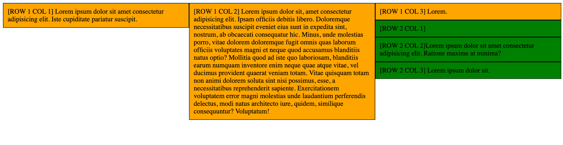
Something went wrong. It would seem that the second row arranged itself in an unexpected way. In reality, however, it arranged itself exactly as it should, because ...that is how float works.
The float property moves an element to the left or right side of its container and lets inline content flow around it. Such an element is taken out of the normal document flow, although it still affects the surrounding layout in its own specific way.
In other words, the green columns landed wherever there was space. And because the second column in the first row was exceptionally tall, quite a lot of space appeared behind it.
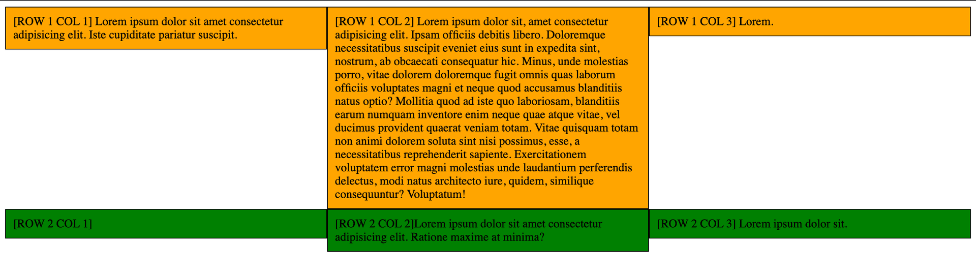
Clearfix
Clearfix is a CSS way of working around the correct, all things considered, behavior of float. You can see one example of a clearfix below.
.row::after,
.row::before {
	content: "";
	display: block;
	clear: both;
}
After adding this code to the CSS file, suddenly everything started working in the way we had expected earlier.
Where is Pixel Perfect in all this?
It got harder. Using the technique above made it possible to move away from archaic tables and from rigidly "slicing" graphic designs. It also allowed us to style certain elements using only CSS. Websites started becoming lighter, but because developers were now doing more things, transferring the graphic concept pixel by pixel required more precision.
So, Pixel Perfect Design means recreating a graphic design in the browser pixel by pixel using code, images, and so on. What is more, every browser and every computer should display the page in an identical way.
Things did not get any easier from there. The iPhone 4 was presented on July 7, 2010. That year, nearly 297 million smartphones were sold worldwide. For comparison, in 2020 the number reached 1.56 billion. Mobile websites started appearing, then RWD, more and more devices, non-standard resolutions, notches, and many other technological novelties.
The 1024x768 resolution, still recognized as a standard in 2010, was becoming insufficient, mainly because the number and variety of available devices grew year after year.
Not only did programmers have more and more work, but designers did too. Everyone was trying to capture the nuances and design something that would be beautiful, modern, and reasonably easy to implement. Clients, meanwhile, expected perfect reproduction. A tear almost comes to the eye when remembering elements moved 1 pixel to the right and 2 pixels down.
Consequences of Pixel Perfect Design
The most obvious consequence of using the Pixel Perfect approach was overloaded CSS code. A lot of workarounds appeared: quick fixes, negative margins, transformations, and even excessive use of absolute positioning. This led to a situation where nobody wanted to return to code once it had been written. Debugging such code was a road through torment. The code became difficult and expensive to maintain, and changes in the design were almost impossible.
On top of that, it caused a lot of stress and frustration on every side. Fortunately, quite a few browser plugins appeared, such as rulers and overlays with a semi-transparent graphic design, which made maintaining Pixel Perfect easier. But it still was not an easy or pleasant task.
Some clients outdid themselves. I remember one who came to meetings with designs printed on transparencies, which he would place against the monitor during presentations. I will pass over the effectiveness of this method in silence, although he always noticed single mismatched pixels.
Different colors in different browsers
And what would you say about different color rendering in different browsers? It turns out that, depending on the browser, those colors may look different. These bugs were also reported, even though they were not caused by a mistake in the craft of either the designer or the programmer. They resulted rather from the implementation of color processing systems in browser engines.
Optical precision
Besides, we are not perfect mathematicians. We are much better at estimating than calculating. According to various studies, humans naturally estimate in a logarithmic way. When we ask a small child who has not yet gone through school-style mathematical indoctrination what is halfway between 1 and 9, we will probably hear 3. Three, not five! Five is in the middle only because that is what we were taught. Three is the logarithmic halfway point, resulting from multiplication. That is also how our brain naturally works.
Worth reading on this topic

Matt Parker
Pi razy oko. Komedia matematycznych pomyłek
Our eye does not have much in common with mathematics either. CSS treats elements as "boxes" and aligns elements according to those "boxes". For our eye, a centered element is not necessarily equivalent to a line running through the middle of such a box. The difference often ranges from one to several pixels. For a human, however, it is noticeable. Graphic designs are often created without accounting for how CSS works, which causes small discrepancies between how the designer aligned a given element and how the browser will do it. In the Pixel Perfect Design approach, this kind of optical precision also has to be taken into account.
The era of Bootstrap and its successors
Then came the era of CSS frameworks, which provided ready-made solutions for the most common elements used to build websites. Thanks to them, it became easier to deliver projects. You did not have to write many elements from scratch. Unfortunately, over time they became a nightmare for developers.
On the one hand, they really did make it easier to deliver some fixed modules. On the other hand, designers prepared their own versions of existing components, often unfortunately without understanding what CSS frameworks are, without knowing their limitations, and therefore still expecting a Pixel Perfect approach. This meant that sometimes even more code had to be written just to override what the framework provided, so that it could be adjusted to the client's requirements and the accepted graphic design. At some point, you no longer know what is worse: custom design or custom design based on a CSS framework. In both cases, a lot of redundant code is created.
Let's leave that behind!
Pixel Perfect is dying
The number of requirements kept growing. Until finally someone thought: this cannot go on. Today, graphic designs are often created based on the Look & Feel approach. In practice, this means that the expected product is no longer identical to the graphic design, but consistent with its assumptions. Practically every project has its own unique style, which with a little effort can be implemented in other projects as well. Maintaining the right Look & Feel requires three things:
- good communication between the designer and the frontend developer - this is crucial, because designers often have a lot of knowledge and experience in User Experience, have a great feel for color, and simply know their craft,
- expanding our knowledge of design - we do not have to know as much as a designer, graphic designer, or UX designer, but it is worth knowing SOMETHING,
- intuition.
The Look & Feel approach means that the prepared graphic design is a set of rules and guidelines, not only for how entire views should look, but above all for individual components, the spaces between them, which colors to use and in which combinations, etc. Today, with large and complex projects, there is not really much room to prepare them in the Pixel Perfect approach. It would require enormous effort from every group, and the results might still not be satisfying. The key to success is flexibility, reusability, and the ability to adapt to the situation and the client's needs.
Style Guides have become the most important part of graphic designs. They define the basic elements of a project, such as available colors, spacing sizes between elements, font types, use of backgrounds, icons, and many other general concepts. Only then is the full layout assembled from these individual elements. With such a Style Guide available, the designer does not have to design every view separately. They compose it from previously prepared building blocks.
CSS in a new form
Old CSS struggled with certain limitations. Tables and floats are only examples. Over time, however, CSS also began to develop and give creators more possibilities, for example by introducing new units (vw, vh) based on the size of the viewport, meaning the visible space where the page is rendered, by adding new ways of arranging elements in a structure (CSS Flexbox, CSS Grid), or by providing comparison functions such as max(), min(), and clamp().
Summary
Pixel Perfect was born in times of significant technological limitations. Over time, implementing this approach became harder and harder, sometimes practically impossible. Today, most companies have already moved away from Pixel Perfect Design in favor of a much more flexible approach, where general rules governing a given project are created. Of course, this creates new challenges for developers, but I think it is a step in the right direction.
CSS gives us far more possibilities than it did even a decade ago. Designers, programmers, and clients usually understand that they are playing for the same team and that everyone is a specialist in their own field. Understanding technological limitations and trying to work out the best possible version is probably the best path to success.
Sources
- Pixel
- float - CSS: Cascading Style Sheets
- The State Of Pixel Perfection
- Pixel-perfect
- Pixel Perfect Web Development: 5 Essential Steps
- Chromium and Firefox display colors differently and I don't know which one is doing it right
- Unmanaged CSS colors
- What exactly is a Pixel Perfect Web Design?
- Everything about Pixel Perfect Design
- Chasing the Pixel-Perfect Dream
- Co się stało z Pixel Perfect Design
- Humble Pi - Matt Parker


Comments (0)
No one has posted anything yet, but that means.... you may be the first.